Digital services are one of the main ways through which government agencies and the people they serve communicate. But just like interpersonal communication, government digital services provide room for misinterpretation; despite technologists’ best efforts, our services do not always present users with a clear indication of where they are (for example, what step they’re on in a process) and what they might do next.
In order to communicate effectively, technologists must therefore adopt a humble mindset. Rather than speaking at users, we should converse with and listen to them in order to better understand their vantage points and to confirm that our services work on their terms. At 18F, one of the main ways we do this is through remote moderated usability testing (which, for the sake of readability, we’ll often shorthand to “usability testing”).
In this two-part series, we’ll provide an introduction to remote moderated usability testing. In part one, we’ll explain what usability testing is and why it’s important, differentiate usability testing from user acceptance testing, and talk about things that aren’t required to do a usability test. In part two, we’ll share a simple, five-step process for running your first round of usability tests.
Help us help you
As defined in 18F’s Methods, usability testing involves observing users as they attempt to use a product or service while they think out loud. The primary goal of a usability test is to understand a product or service’s usability, which is roughly how learnable and adaptable it is, and how good it is at preventing users from making unfixable errors. This sounds simple — and it is — but it’s important to realize that watching someone use something you made can be an emotionally difficult, humbling thing to do.
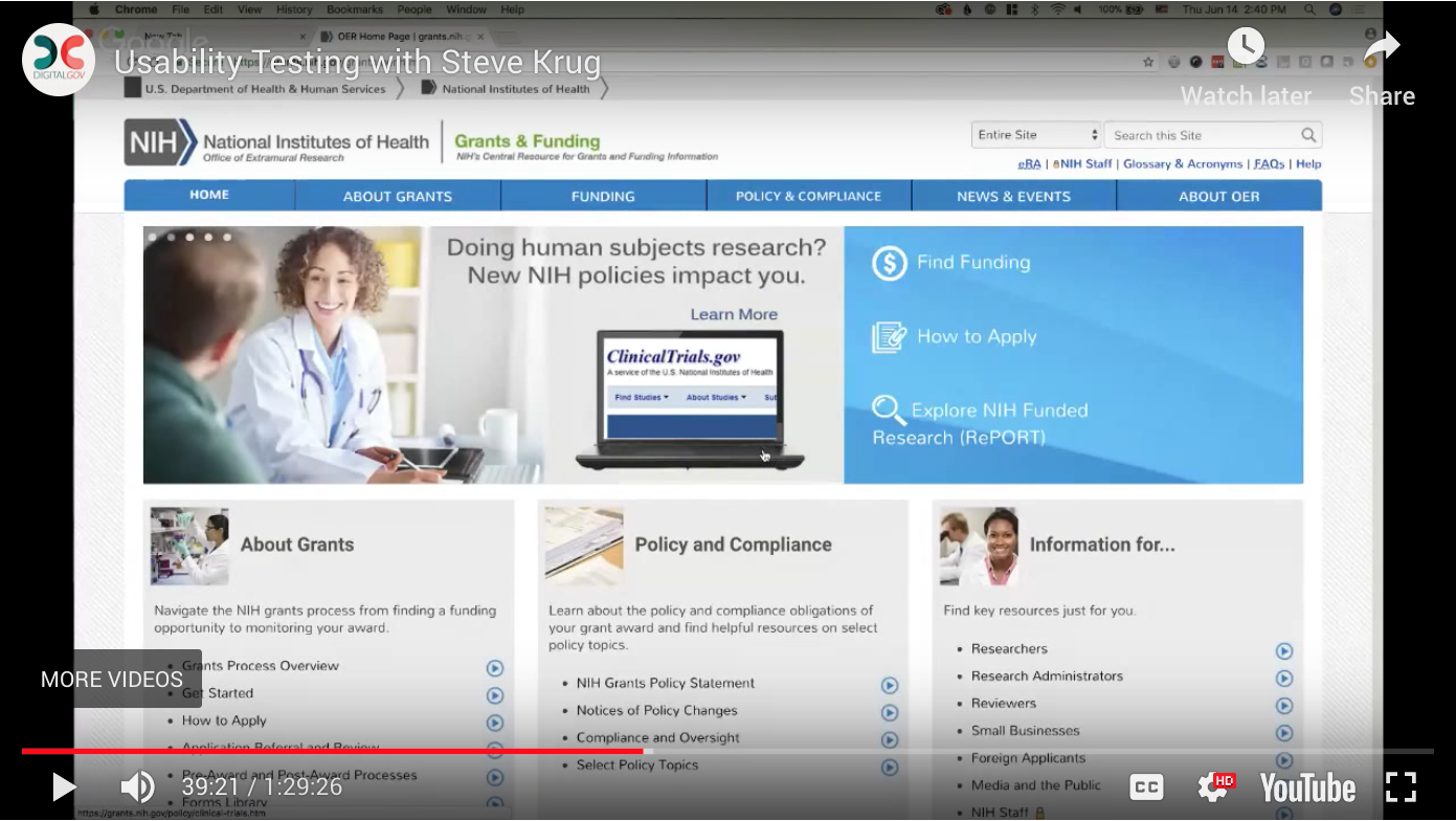
A lot of subtle elements go into running a well-moderated test. So before we get too far, please take five minutes or so to watch the following, recently recorded video in which usability expert Steve Krug moderates a test for Digital.gov and the National Institutes of Health (NIH) (This link starts the video at the 39-minute mark, when the test begins). Note especially how Krug interacts with the participant.

That doesn’t look too difficult… right?
Left to our own devices
At 18F, we strongly prefer remote moderated usability testing (as demonstrated in the video above), in which moderators, observers, and participants join a video call from the comfort of their computers. We do this for a few reasons. First, as a distributed team, we default to remote-friendly ways of working. This gives everyone on our team a chance to participate. Second, because our agency partners serve users from across the country, a remote-first approach lets us hear from users regardless of their location.
There are times when in-person testing makes more sense. For example, we prefer in-person testing when we want to better understand the environment in which users normally interact with a government service (at which point our usability test bears some resemblance to a contextual inquiry). We also prefer in-person testing when our users aren’t especially proficient with, or don’t have access to, video-conferencing software.
Risk and reward
Usability testing helps people evaluate usability and gain insight into user expectations. In a government context, it can also help:
- Mitigate risk. Government digital services take time to build. Iterative design, paired with frequent usability testing, gives us more opportunities for course correction.
- Align teams around what works. Design moves slowly when decisions are subject to over-analysis and internal compromise. Usability testing can help teams move past personal preferences by focusing on what actually works for users.
- Put success metrics into context. Government often thinks about research through the lens of statistical significance, but a user’s experience is not wholly quantifiable; numbers only say what happened, not why. Usability testing can make us aware of things that aren’t easily measured, like what’s astonishing or confusing for users.
- Help normalize a proactive approach to customer service. Customer service is often thought of in a reactive way. If someone complains about a government digital service on social media, government needs to not only respond to the complainant but also to the source of their complaint. But what if it were the other way around? What if we identified and resolved sources of frustration without requiring users to bring them to our attention first?
Acceptability vs. accountability
People who are more familiar with federal procurement often ask how usability testing is different from user acceptance testing, or UAT. Although they sound similar, the two are actually quite different.
UAT is a form of acceptance testing that enlists users to determine whether or not — yes or no — a service meets its functional requirements. UAT is often facilitated by product owners or Contracting Officer’s Representatives closer to the end of the procurement process (hence the word “acceptance”), which can occasionally result in a waterfall approach.
Outside of the fact that waterfall doesn’t allow for course correction, there’s an even bigger issue: focusing on acceptability risks conflating our ability to meet requirements with our ability to help users get things done. But user acceptability is not user accountability. Just because we’ve checked a box doesn’t mean that we’ve satisfied users’ needs or met their expectations.
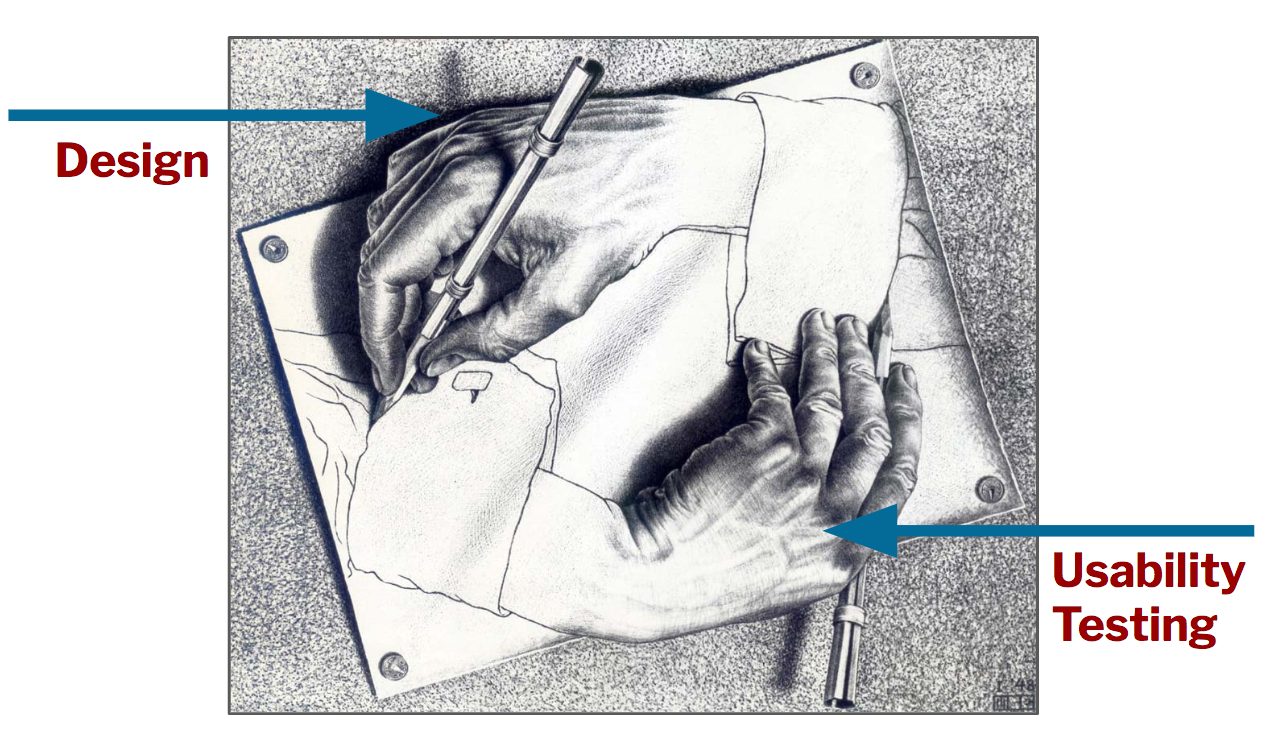
In the best case, a team’s design powers its usability tests and its usability tests power its design. With apologies to the artist M.C. Escher, you can imagine this depicted in the following way:

Closer than you think
The last thing we’ll cover is a shortlist of things people often think of as prerequisites to usability testing but actually aren’t.
First, usability testing doesn’t require a lab. Remote usability testing can be done entirely online using video-conferencing software.
Second, civil servants shouldn’t need approval to do usability testing. Executive Order 13571 directs agencies to “establish mechanisms to solicit customer feedback…” and usability testing is just that: a feedback mechanism.
(Many people wonder if the Paperwork Reduction Act, or PRA, prohibits federal agencies from performing remote moderated usability testing altogether. But a 2010 OIRA memo confirms that “facts or opinions collected through direct observation do not count as information under the PRA.” Civil servants should, however, chat with their agency privacy office about how to appropriately store and maintain the information they access during a usability test.)
Third, usability testing doesn’t require any expertise. While there are plenty of books on design research, and people can certainly get better at moderating tests with practice, the hardest part of running a test is reading the script (which we’ll address in part two) and listening attentively.
Life-changing magic
In some ways talking about the life-changing magic of usability testing is more fun that actually diving into the actual nuts-and-bolts themselves! For example, this Medium post by the US Digital Services team at the Department of Veterans Affairs describes their awesome work in helping veterans apply for health care benefits online. Do check it out. Closer to the end of the post there are some great demos of public servants moderating usability tests.
Hopefully you’re just as jazzed as we are. In part two of this series, we’ll share our five-step approach for running remote moderated usability tests.

