Since our launch of the Draft U.S. Web Design Standards last September, hundreds of people have provided feedback on the project through traditional approaches like filing GitHub issues and emailing us.
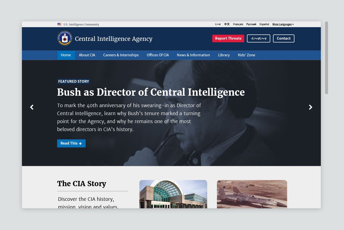
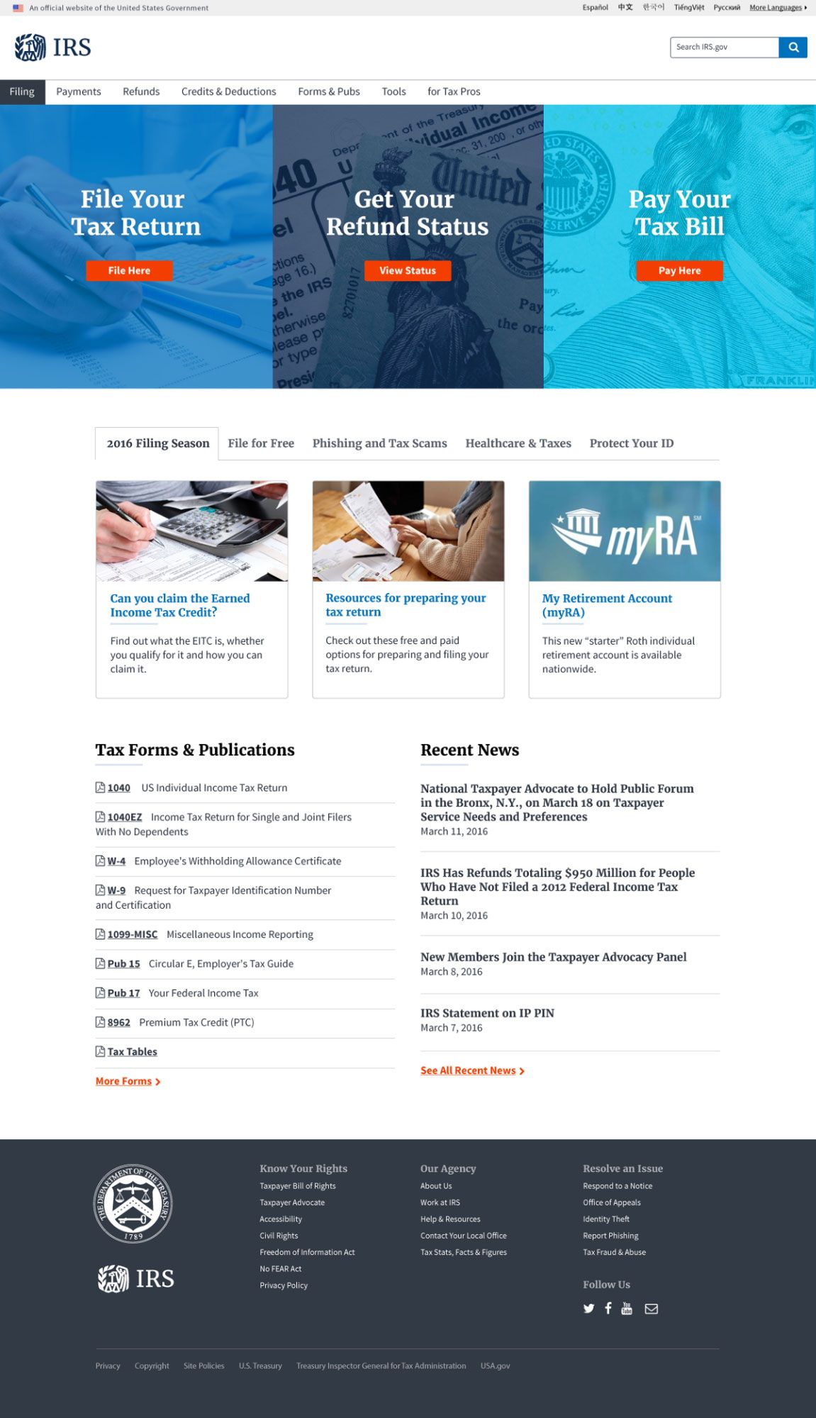
We also received one slightly less traditional submission: Andrew Miller, a user-interface designer and front end web developer working with Sandia National Labs, decided to use the Draft Standards to reimagine cia.gov as well as a prototype for a new mobile and web experience for the Internal Revenue Service (IRS).
He did this as a design exercise for himself, he says, and as a way to test out the Draft Standards in action.
“I wanted to show that this living pattern library can be successfully applied to a static, content-based government website,” he wrote in a Medium post outlining his approach. “After familiarizing myself with the [Draft Standards], I found it easier to iterate and build off of the visual standards.”
We reached out to Andrew to ask him about his experiment, what he learned, and what he would recommend to other designers who might want to test out the Draft Standards for their own design exercise.
Melody Kramer: How did you learn about the Draft Standards?
Andrew Miller: I was introduced to the design standards by colleagues here at Sandia, while looking for examples of pattern libraries and application frameworks. I was interested in finding that the Draft Web Standards were able to seamlessly blend accessibility with minimal and lightweight visual guidelines that could be scaled up and adapted to meet the specific needs of any application; I was hooked immediately.
 *Andrew Miller used the Draft Standards pattern library to
prototype a new cia.gov experience as a design exercise.*
MK: You decided to mock redesign the CIA website and are working on a mock redesign of the IRS? Why?
AM: It started when I was reading about applying the Draft Standards. I read articles introducing the Draft Standards and discussing how government websites were going to be attractive and intuitive soon. I went to the Dashboard page (link removed) of 18F to start looking how other groups were using the Draft Standards and found a lot of great examples. I could really see the standards morph and adapt with each project, yet still retain the same principles, tone, and style.
But I found that there wasn't an easy way to compare or begin to quantify the effect of following the standards. Some of the examples were initiatives that were new and didn't have an "old" version. So I wanted to apply the visual standards with a government household name, but one that wouldn't necessarily be on the shortlist for redesign. I wanted to excite people and to show that ANY government website can take a page from the CIO Government Playbook and Draft Standards.
As for the IRS mock redesign, I spent some time at analytics.usa.gov and felt it fitting to redesign the most used website in the last 90 days. I wanted my designs to relate to people who wouldn't otherwise know about the continued effort of 18F, the USDS, and the work President Obama spoke about at SXSW.
 *Andrew Miller used the Draft Standards pattern library to
prototype a new irs.gov experience as a design exercise.*
MK: What did you learn by using the Draft Standards?
AM: I learned that, above all, the service your website provides is more important than anything else. No amount of chrome, animation, bells, and whistles will do anything to convince users otherwise if the experience is bad. With government websites and applications, the demographic is so diverse and often with the full spectrum of technical expertise.
However, more often than not, users are referred to these digital services as the primary interaction point with government. Agencies and services don't get a second first impression, and sour experiences are not easily forgotten. I learned that sometimes designers have to make considerations for accessibility and usability that aren't mind-blowing, innovative works of art; sometimes designs aren't meant to excite people, or "wow" them. I learned that trustworthy, helpful, and intuitive designs can still be attractive.
MK: What has the reaction been?
AM: I don't want to jinx myself and say 100 percent of the reaction has been positive, but barring a barrage of negative comments, 99 percent of the content has been well received. People have told me that they didn't notice the design of government websites before, but seeing the art of the possible, they now recognizing it everywhere. Some didn't realize just how often they interact with government websites, but they now begin to see the impact of a poorly-designed user interface and negative user experience. "It takes a village" to design useful government websites. If my work can inspire people to get involved, even with providing feedback, then I've been successful.
MK: What advice would you give to another designer who wanted to attempt the same feat?
AM: My advice to other designers who want to do what I've done: Just go for it! Don't get hung up on minor details, don't overthink it, don't spend too much time perfecting every pixel. That’s not the point and more importantly, it’s not agile. I only spent one weekend doing all the work for the cia.gov redesign.
If my designs had garnered negative reviews, that would only have lead to a better design the next time around. Take the feedback and iterate, rinse and repeat. That’s what designers should be doing in their daily work anyway. Treat every comment or critique as a chance to improve your designs because these are government websites, and every person who comments is a user. Also, read the standards; even if you don't attempt a redesign, you will have appreciation for all the thought that goes into the work 18F, the USDS, and others are doing.
MK: Where do you look for design inspiration?
AM: I look for design inspiration everywhere, but like my keys, I rarely find it. Inspiration for me usually happens after designing something horrible for the 20th time and almost quitting. I am always looking for it though on design blogs, Dribbble, Behance, etc. Some would say inspiration comes when you least expect it: walking, in the shower, on vacation, doing something mundane. But that spontaneous design inspiration only comes to me when my brain deconstructs designs I've seen, and pieces together a combination of many designs. So being connected, reading blogs, looking at what other designers are doing might not lead to something immediately, it almost always inspires one of my designs in some way.
MK: What improvements/changes to the standards would have made this easier to do?
AM: I'd like to see the visual standards expanded. I know it pays to keep them high-level and broad, to allow others to create branches specific to their agency or application, but for groups that haven't got the resources to develop their own pattern library, it would help to have more guidance. I know they are currently in draft, but the initial openness to publish them lead me to believe that iteration would happen rapidly. I'm excited and looking forward to the next visual standards release!

